Every designer receiving a new order – rejoices as a small child in anticipation of the holiday. He is excitedly hoping that here this project will be just a bomb and will to rise him to the top of the pedestal. And he starts imagine how proud he would be and how he would show this project to his next client and how he calls the price 3 times more expensive….. And many-many others dreams come to his mind.
But when the meeting with the customer is over he needs to sit down in front the computer and start sketching. And then we come across a routine. He realizes that he do not fully understand what the customer needs and where to start from. For example, our hero received an order for the execution of the tea packaging design.
He was explained how the packaging itself will look technically. Naturally, the design layout itself should be executed on a flat scan from the package, which looks like this:

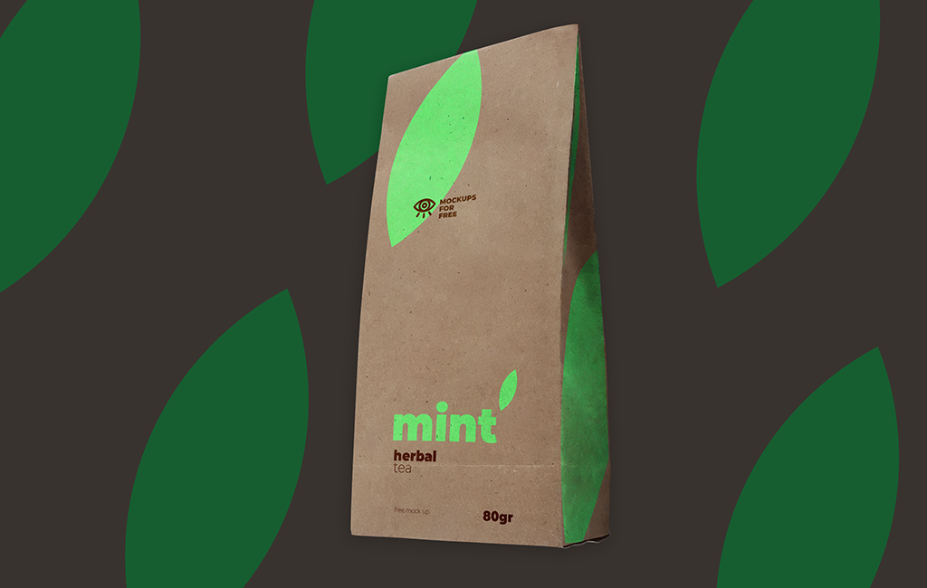
And the biggest mistake is to start making a design directly on it. It can pendant to a boring and organic design. It will be better if you start working on the design of such a package with a sketch on the mockup. To do this, you find a suitable mockup like this one:

and try on the text and graphic elements directly on the mockup.

Here is the advantages of this approach:
- You yourself are guided in the proportions and you can evaluate the result and estimate how this package will look in reality
- You can show the client even intermediate options to understand the direction
- As practice shows – the designs executed on mockups receive less edits from the client
Conclusion:
Using Mock ups Saves You time & Money for your Client, Keeps Mutual Understanding Between The Two Parties.
The mock up used in the example can be downloaded here.
How to use mock up – read here.


